I learned a great lesson in aesthetics last week and paradoxically, I was both disappointed and satisfied.
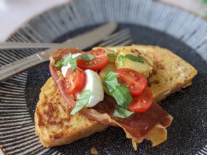
First of all, I made the plate of food that you can see in one of the pictures. You’ll know the one right away. On the face of things, it has greater aesthetic value than the other one which, you might consider, has much less aesthetic value.

The first one – French toast made from home-crafted sourdough bread, dipped in egg and fried in butter, with crisped Parma ham, plum tomatoes, buffalo mozzarella, fried potatoes, torn basil and drizzled with garlic olive oil – was the first half of the great lesson. I sat down to it on Saturday morning with no small amount of eagerness and with a big smile on my face. Alas, that smile didn’t last very long.
Whilst this French toast brunch looked the part – aesthetically speaking it made my mouth water – the reality was much less appetising. In short, none of it worked. In short(er), it was a disaster.
Th texture of the French toast was too soft when combined with the mozzarella. The mozzarella clashed with the fried potatoes. The Parma ham was so out of place as to be fancy dress at a funeral and in general, the collective was hodgepodge of flavours and textures which were completely at odds with one another. It was a row on a plate. It was a drunk in a China shop. It sang out of tune while scratching a blackboard. It was clickbait. It was travel sickness on your holidays.
“These things happen, Mike,” I consoled myself. “You tried something new and it didn’t work. Don’t fret the bit out, man.”
The disappointment here was that the dish looked so appetising and yet tasted so much of failure. Don’t get me wrong, I cleaned the plate (waste not, want not) but I did so with a frown, both at my own ineptitude and how I had been fooled by the bright colours and the overall flashy aesthetic. Each component on the plate was delicious on its own but as a group, they crashed and burned.
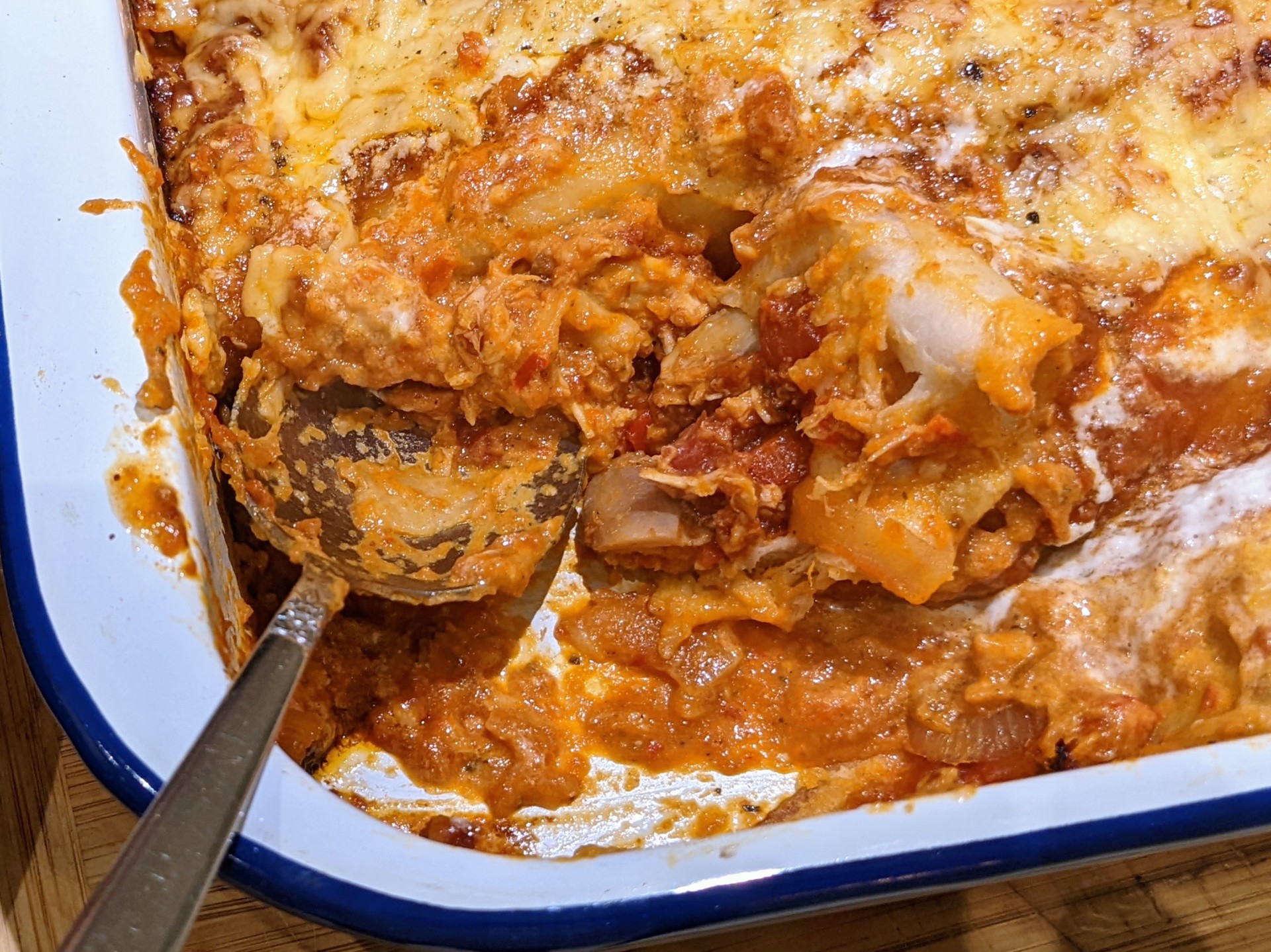
Later that evening, I roasted a chicken; this was the second element of the great lesson. I didn’t know what I was going to do with the chicken but I roasted it anyway with the notion that I’d figure out where I was going after it came out of the oven. That food destination is the other picture, the one which doesn’t look overly aesthetic. In fact, in terms of looks, I will admit it seems as appealing as a dog’s dinner.
However, in this instance, despite the messy visuals, the taste of my chicken enchiladas was through the roof. I used shredded roast chicken meat, which I combined with a tomato and garlic enchilada sauce and onions and peppers. The spice combination included oregano, smoked paprika, chipotle powder and cumin and there was even a red chilli pepper in there to hammer the taste lesson home.
Half the sauce I mixed into the shredded chicken and veg and this mixture was wrapped in tortilla wraps, snuggled into a casserole dish and was then topped with the remainder of the spicy sauce, slathered with crema and bombarded with grated cheddar.
Compared with the failed brunch of textural hell, the enchiladas were divine. Spicy and moreish, succulent within and crispy without – it is no wonder that Mexicans are (per capita) the fattest nation on Earth. It was a fiesta on a plate. It was a hot water bottle on a cold spring evening. It was a melodious, two-way harmony which, when intertwined, created an elusive third voice. It was love. It was waking up on a Saturday and thinking it was Monday.
I suppose I have always known this but Saturday’s lesson was a salient reminder: A dish can be a bright and as colourful and as visually appealing as you like, but if it doesn’t have the taste balance, it’s never going to work.
Aesthetics and visuals, whilst appealing, count for nothing when food isn’t tasty.
In hindsight, my visual perception of the enchiladas is now superior to the French toast brunch. Now I look at the pictures and for the enchiladas I see depth of flavour, warmth and satisfaction.
With the French toast, I see garish sloppiness and disappointment.
To paraphrase a soft drink advert on the telly from yesteryear, image is nothing, taste is everything.
‘The Parma ham was so out of place as to be fancy dress at a funeral and in general, the collective was hodgepodge of flavours and textures which were completely at odds with one another’


